For some, fitness means running a marathon.
For others — a stretch in front of the mirror.
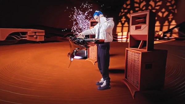
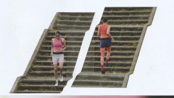
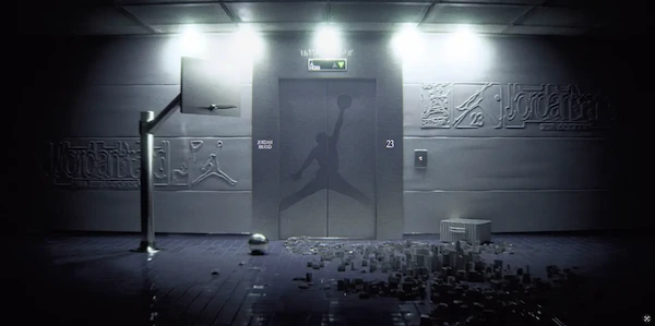
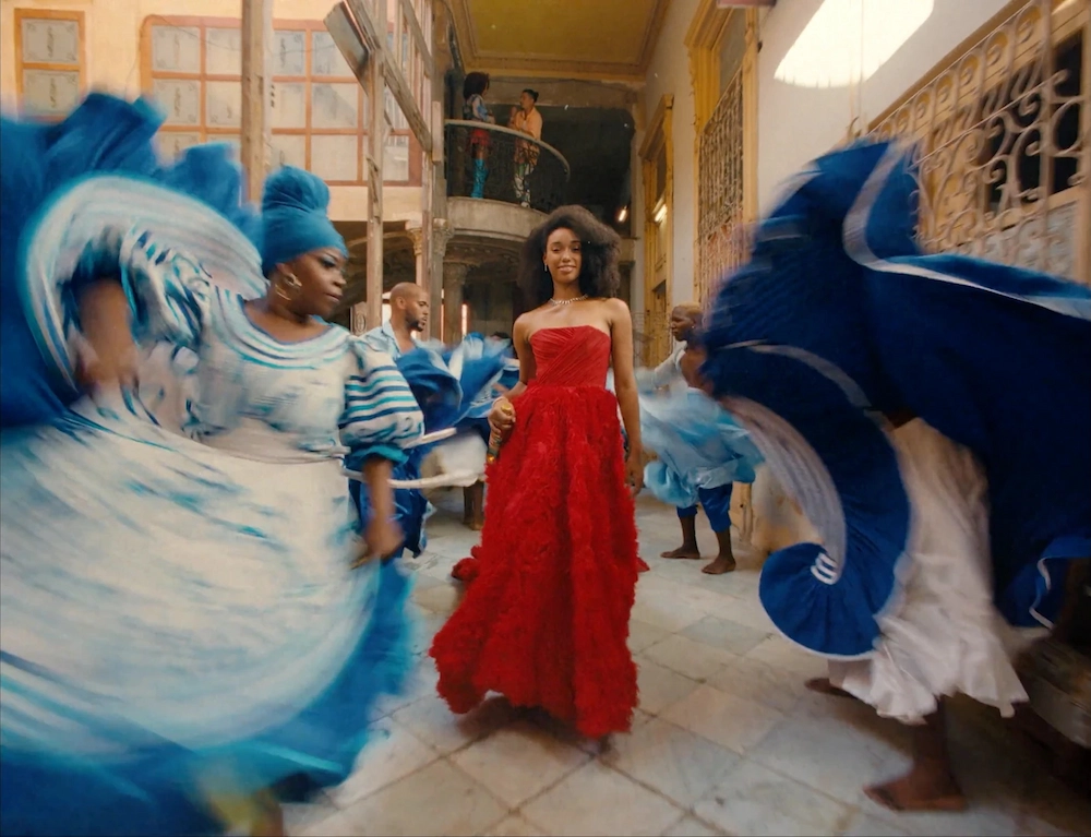
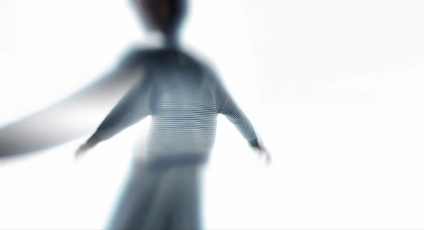
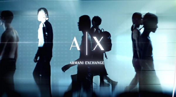
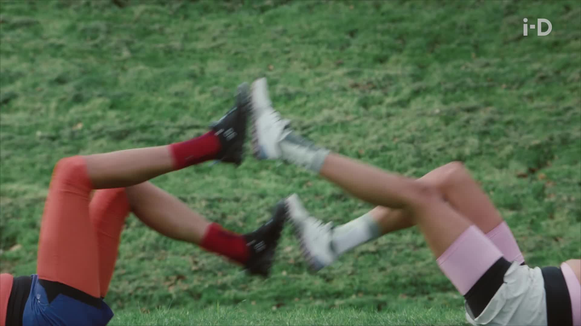
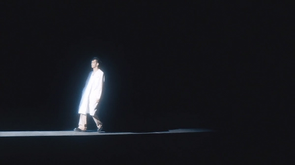
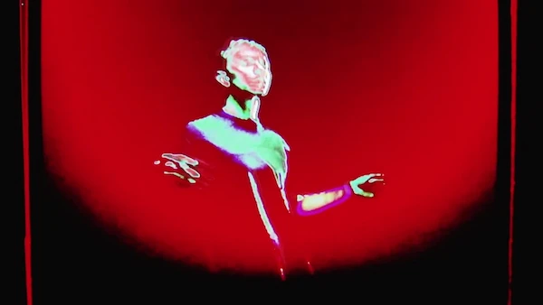
That’s why we approached this campaign as a study in physical identity — a series of gestures, motions, and postures that go far beyond performance.
We explored this visually through a tactile mix of 3D shapes, reshoots, pencil sketches, and layered textures — merging virtual techniques with analog imperfections into a fluid rhythm that treats the body as a language, and motion as meaning.
The result is a multi-sensory alphabet of movement, with each letter in this A–Z as a personal expression of what fitness can look like — and, more importantly, what it can feel like.


.STROY%20Main.webp)